Creatives for ASO: The Complete Guide for all App Graphics
Did you know that creatives are crucial for your app store conversion? That users don’t really read app pages — they scan them? Of course you did. But if you have an app, we definitely recommend having this post in your “saves” for a full checklist on how to optimize all your app graphic assets for the app store. Plus, all the important nitty-gritty details of sizes and proportions you can just copy-paste and send to your designer are gathered here. So let’s dive right in!
Table of Contents
- Google Play and iOS differences in creative assets
- App store icons
- App Store Screenshots
- Google Play Feature Graphic
- App Store Poster Frame
- ASO Video
- iOS 15’s Newest Features
Google Play and iOS differences in creative assets
The first important thing to understand about graphic assets for apps is that the conversion funnel works differently based on whether the app is on the App Store or Google Play.
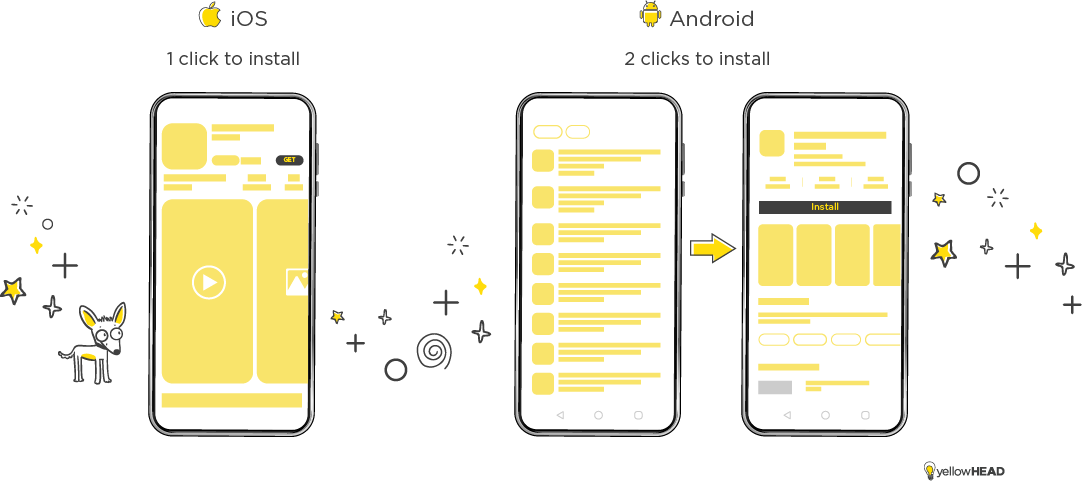
When searching for a generic term (as opposed to a branded one, which we’ll get to later) in the Google Play store, you’ll most likely receive a list of results, showing only small icons and app titles. This means the icons on Google Play are the top priority creative to think about. From the search results page, users will (hopefully) click on your app, arrive at the store page, and only then potentially install your app.
On iOS, within the search results page, apps are shown with icons and three screenshots (if it’s portrait. 1 if it’s landscape, we’ll get to that as well). What’s more, the installation usually occurs when users are on the search results page, which means your app icon and the first three screenshots should be treated as one conversion unit, which allows much more room for graphic messaging.
Branded Searches on Google Play
On Google Play, when users search for a specific brand, the 1st result (usually, the brand itself) shows up larger than the others and includes the first screenshots, depending on the screen and device size (similar to iOS). This “extra real estate” pushes the competitors to the bottom of the page, making the following results much less visible than they would be in a generic search. This means – that if you’re ranked #3 for a competitor’s keyword -you might not be as visible as you think.
App store icons
Your app icon is the most important asset for conversion, so frequently testing and optimizing it for conversion can have a noticeable impact on your overall performance.
The great challenge with an app icon is the lack of room for detailed messaging, so make sure your icon conveys the essence of your app in a way that’s recognizable and appealing.
For many apps, this is a no-brainer, placing their app logo as their icon. This is a great method for conversion for products that also have a strong web presence, by creating an holistic omni-channel look for the product, or in other terms – helping users identify your app, as the mobile extension to the product they know and love.
ios app store icons
App icon sizes differ by the Apple device. App developers can make an app icon, measuring 1024×1024 pixels, to display in the App Store and let the system automatically scale down your large app icon to produce all other sizes, or supply multiple versions for a customized appearance of the icon at specific sizes. See more about iOS app icons here.
Android Google play icons
Google Play icons are smaller than the iOS ones, 512X512 px, and they are used in various locations such as the store listing, search results, and top charts.
Google Play has become increasingly strict about additional, irrelevant graphic elements in icons, such as banners and notification symbols, so be sure to avoid using them. See more do’s and don’ts for Google Play icon design here.
Updating an app icon
This is just another difference between Google Play and App Store ASO:
Your Google app metadata can be changed on demand at all times, through the Google Play developer Console, whereas your App Store metadata will need to wait for your next app version release, so make sure to align your changes to the developer team timelines.
App Store Screenshots
iOS screenshot
On iOS, you can upload up to 10 screenshots. They can be either portrait or landscape and they need to present a more accurate app experience.
How accurate should this app experience be? It very much depends on the Apple’s reviewer you land on. We’re seeing screen sets all the time, also on the iOS side, which definitely makes us wonder how they went under review, but they did. So it’s your call if you want to try it or stick with the most strict guidelines out there.
Screenshot dimensions
Different screen sizes need to be applied depending on the device size, and it is important that each one displays the relevant device on the screen (e.g – iPad screenshots should show an iPad). The main screen sizes are 6.5 inches, and 5.5 inches. There are also 5.8 inches, and the new 6.7 inch (iPhone 14 max) but those sizes can also use the 6.5 inch screens you uploaded to the App Store Connect, so if you have limited creative resources, it is not crucial to prepare all sizes. For more iOS screen specifications check here.
Android screenshots
On Google Play, there is much more room to play.(Saw what i did there? 😉 ) You can upload between 2 to 8 phone screenshots. The maximum dimension of your screenshot needs to be less than twice as long as the minimum dimension. Within that range, go wild! Screenshots that break the regular sizing scheme (neither portrait nor landscape), will really grab the user’s attention and can boost conversion. Screenshots must be PNG or JPEG, 16:9 or 9:16 aspect ratio, with each side between 320 px and 3,840 px. See the full Google Play screenshot sizes here.
In recent years, Google is very supportive of apps that support large screens, so we recommend including tablet screenshots in your ASO strategy.
You have up to eight 7 inch tablet screenshots with each side between 320 px and 3,840 px, and the 10 inch tablet screenshot with each side between 1,080 px and 7,680 px.
Google Play Feature Graphic
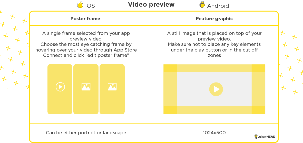
In case your app has a preview video, the feature graphic is the thumbnail that is placed on top of it.
In apps with video, the feature graphic takes up most of the storefront view, making it a crucial asset for conversion, so make sure to include it in your conversion rate optimization strategy.
Some important tips to keep in mind regarding the Feature Graphic:
- Keep prominent visual elements and the focal point toward the center of the Feature graphic, but take into account the play button that is placed in the center, and make sure it’s not hiding any key elements like the brand logo, app name, or main UI.
- The edges of the feature graphic are cropped by around 70 pixels on each side, so make sure nothing important is placed within the cutoff zones.
- Feature graphic sizes are 1,024 px by 500 px.
- You need to upload to the Google Play Console, regardless if you have a preview video or not.
App Store Poster Frame
The poster frame is not an image like the feature graphic, but rather a selected frame from your app preview video, it is fundamental for conversion and it’s hard to overstate its importance since this is what the user will see before the video is autoplayed.
By default, your poster frame will be the frame that appears in second 5, but you can edit your poster frame in App Store Connect.
ASO Video
An ASO video can really help deliver the essence of your app in the most compelling way.
In games it’s considered a must (would you download a game without taking a glance at the gameplay? Though so) And also for more complex apps it can not only help with conversion, by giving the user a walkthrough of the app and it’s capability, but it can also help in retention, as the user will get a good look at what he can expect from the app, so he will be much more convinced when downloading it.
An ASO video is important for both Google Play and iOS, but it works very differently in both platforms so here are some must-knows about each operating system’s requirements for a video:
Google Play Video
The video is played through YouTube, so the orientation must be landscape. The video should be either public or unlisted, with ads switched off and no age restrictions. Google does not specify the length of the video, but only the first 30 seconds can be auto-played (depending on users’ phone settings and network connection), so it is not recommended to exceed that time frame. See more info on Google Play preview video here.
App Store Video
An app preview demonstrates the features, functionality, and user interface of the app in a short video that users can watch on your app page. Since app previews autoplay, they are crucial for conversion and you need to plan them well. For tips and tricks on creating a great ASO video, see this blog post dedicated to the subject.
Apple is much more strict than Google in their video guidelines, and they demand a very accurate UI look and feel, with app previews only capturing footage of the app itself, without people interacting with the device (such as over-the-shoulder angles or fingers tapping the screen). Apple also recommends capturing the native resolution of the UI instead of zooming in on the app view.
The iOS video can be either portrait or landscape and should be between 15-30 seconds long. For more App Store video specifications including size formats, audio and resolutions, check here.
iOS 15’s Newest Features
With the iOS 15 launch, creative teams are just getting more and more busy!
So many growth opportunities for ASO practitioners, so little time.
In-App Events (IAE)
In-app events are timely events within apps and games such as game competitions, movie premieres, live-streamed experiences, and more. People can discover your in-app events right on the App Store on iOS and iPadOS, giving you an entirely new way to showcase your events and expand their reach, whether you’d like to reach new users, keep your current users informed, or reconnect with previous users.
For the In-App Events, you’ll need an event card and an event detail page, both can be a video or an image. A video can definitely catch the user’s intention faster, but it also takes much more creative resources, so plan your ASO strategy according to your creative bandwidth.
Custom Product Pages (CPP)
The App Store’s recent game-changing features, can boost the performance potential of your app, but they also require a whole new set of creatives. With Custom Product Pages (CPP) You can create additional versions of your App Store product page to showcase different features or content within your app such as a particular sport, character, show, or gameplay feature and share them with different audiences through unique URLs. You can also use these pages to showcase seasonal or culturally relevant content. Each custom product page can include screenshots, promotional text, and app previews that are different from those on your default product page, but they have similar sizes. So follow the screenshots and video guidelines also for your CPP.
Product Page Optimization (PPO)
AB testing is no longer available, only in Google Play, Apple also released the Product Page Optimization feature, another significant new way that can help you test those creatives for optimal results.
With the PPO feature you can test your app icon, screenshots, and app preview. Textual assets are not available for testing in iOS.
So….
Now that you have all the info, you’re left with no excuses for a mediocre storefront. With this guide in hand, you can create your storefront to really show off your product and watch your creatives perform better than ever.
If you would like a (very creative) hand with it, don’t hesitate to reach out to our ASO (app store optimization) experts and professional ad creative design studio.


