

Remember August 2019, when Google Play officially announced a visual makeover to the store? Well, that makeover changed the game for organic explore traffic and screenshot legibility.
Implemented video
Guess what? It finally happened!
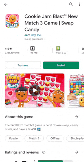
- Inset Video: Google is no longer redirecting users to YouTube to watch app previews. The linked YouTube videos are now playable from within the Play Store itself, in the tiny window of the app page. This means the video is more easily accessible and that the viewing size needs to be reconsidered. Visuals in the video need to be easily understood from a small size: text should be used at a minimum, and if necessary, at a huge font size.
- Autoplay in Branded Search results: Searched for a brand-related keyword? Just wait a few half-seconds and the video of the main result will start auto-playing in the preview!
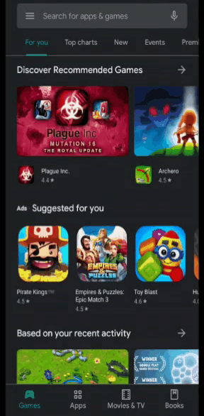
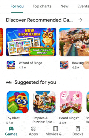
The Google Play makeover included a cleaner look and feel similar to iOS with four separate tabs at the bottom of the screen: Games, Apps, Movies & TV and Books.
- Personalization: With the new “games” and “apps” sections, users can browse each to get more personalized recommendations such as: “You might like” and “Suggested for you”. These selections are based on that user’s particular browsing and download habits so they are more relevant to their interests. The result: increased traffic from Organic> Explore in your acquisition reports and overall, a more important role in your app’s acquisition strategy.
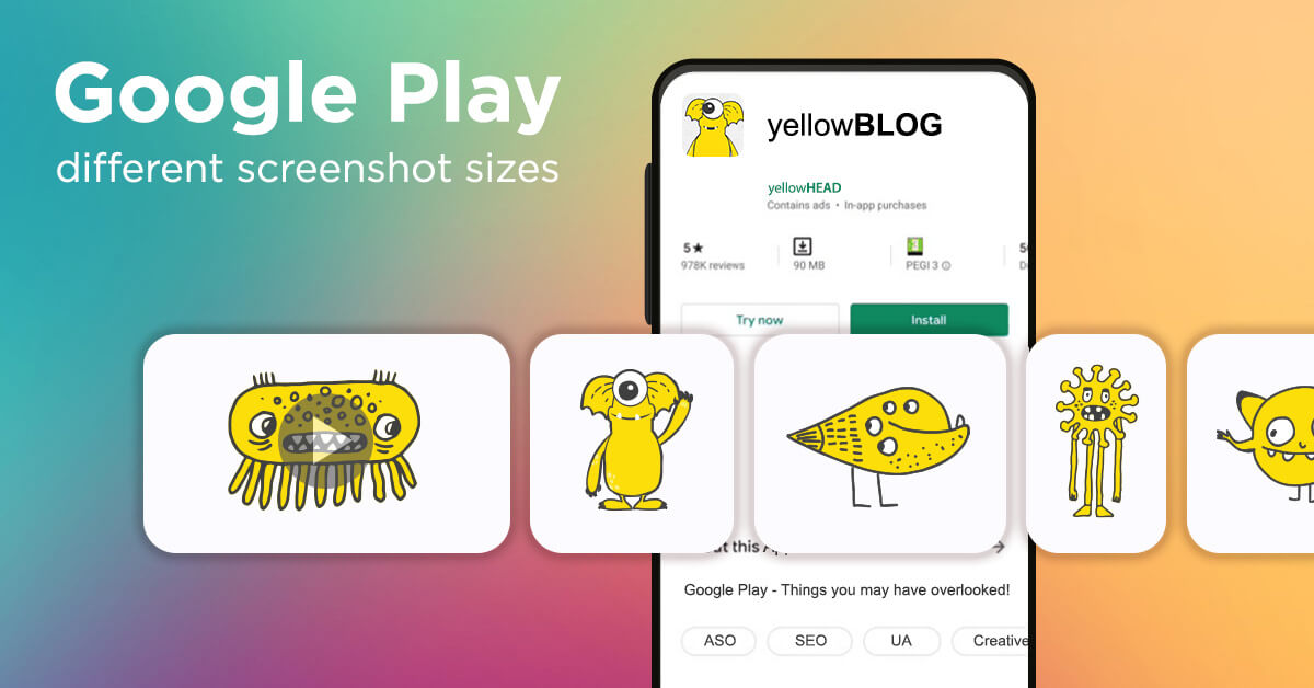
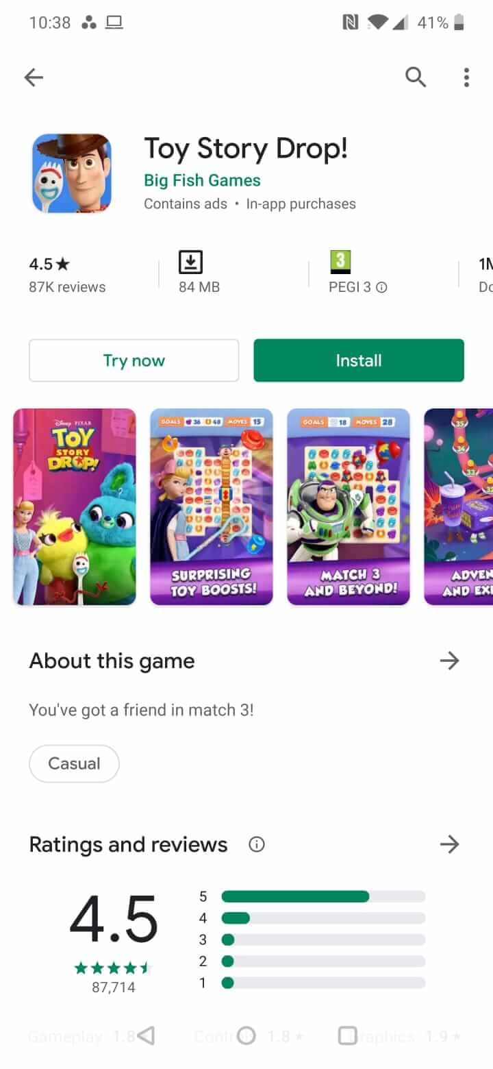
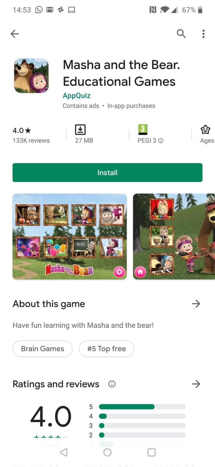
- The App Page: Along with the restructuring came some important changes in the look and layout of the app page. The icon and screenshot sizes were affected, making text legibility a difficult challenge. The old-school standardized “landscape-OR-portrait” screenshot size is now a thing of the past.
Old Visual New Visual
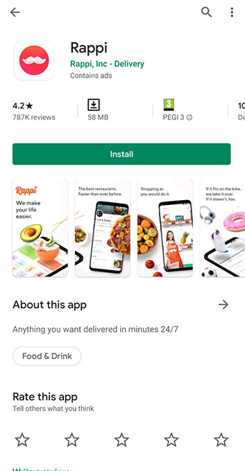
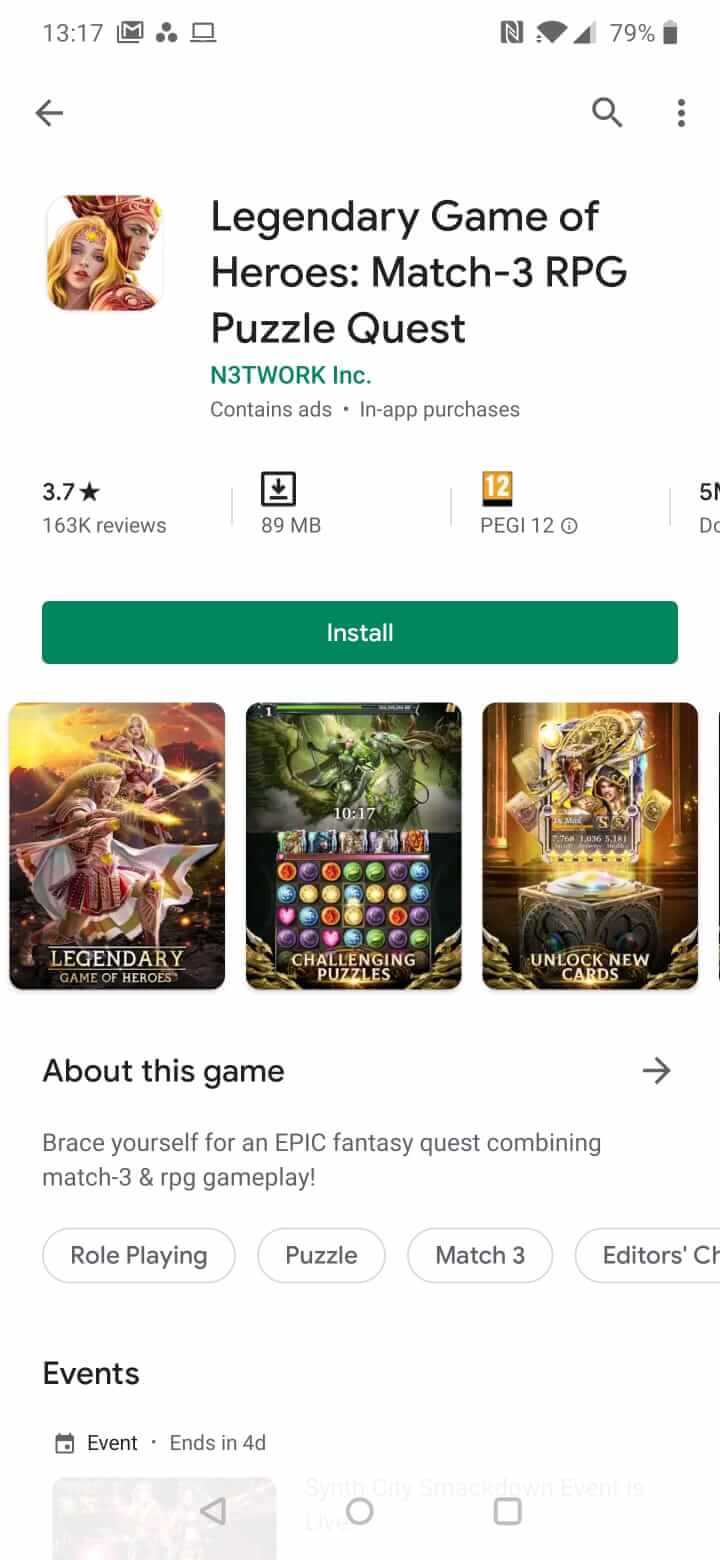
a) Portrait Issues
The Portrait size commonly used (9:16) now looks smaller and more narrow. Any text in the images is now smaller and, more often than not, illegible. Any minimal visual details are also difficult to understand at first glance. If users don’t open the screenshots, most of the content becomes unrecognizable.
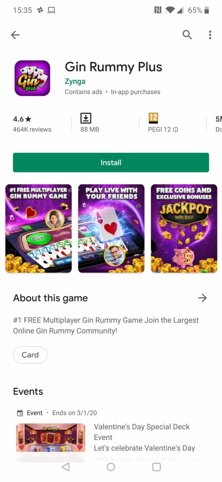
b) Landscape Issues
The traditional Landscape size (16:9) now leaves users in endless scrolling since the image is seemingly very wide. Such a wide size is not always necessary.
FYI – Google Play doesn’t have specific size requirements! The challenges above can be easily overcome by using any range of size ratios.
So, why are developers still using traditional portrait vs. landscape size options?
There are several issues that were keeping developers away from moving to more friendly sizes:
- There are many devices, resolutions and screen sizes out there, making it difficult to know how different users will see the screenshots. However, we do know that, across all devices, the Portrait size is now much smaller – one way or another, an improvement is needed.
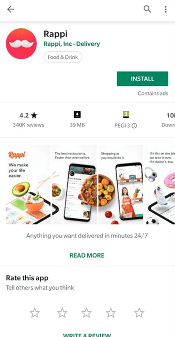
- Google Play requires a minimum of 3 landscape (16:9) screenshots to get recommended in certain collections, so you must have all your screenshots in that size, right? Wrong.
The above requirement refers to the carousel of recommended apps in the Games section. Certainly, you want to be included there since it provides great visibility and is eye-catching in nature.
Well, we have a solution!
If you want to be included in a carousel in the recommended section, just add 3 landscapes 16:9 at the end of your screenshots. These images should be geared toward users that are not specifically looking for your app, but rather “might like it” (in Google terms). In other words, use the images to improve CvR for Organic Explore in particular.
Now that 19:6/6:19 are not the only choices, we see developers going wild and their store pages look amazing!
“Portscape” and “Landtrait”
Many apps with portrait screenshots are moving to the size that we at yellowHEAD love to call “Portscape”.
Portscape (noun, /pôrt-skāp/)
An image size wider than portrait and shorter in height.
This size is recommended for apps that have long text and small details, as well as for games played in portrait mode:
533:711 533:711 5:8
Landtrait (noun, /land-trāt/)
An image size narrower than landscape.
For landscape games (especially games with long tables or card games), we recommend the “Landtrait” size. By making the images less wide, it minimizes scrolling so the user can already see the next screenshot as soon as they start scrolling the first image.
43:30 43:30 4:3
If you don’t have a video, an alternative is to use both sizes. Start with a Landtrait used as a teaser for your app – this will trigger the user’s curiosity and encourage scrolling.
Conclusion:
Google Play is continually changing and we need to change with it.
The commonly used sizes are not relevant anymore. We have a lot more freedom to combine and experiment with different sizes to encourage scrolling and increase CVR.
We’d be happy to share more insights with you as they come – just sign up for our newsletter!


